📈Trade, Tariffs, and Turbulence; How Trump’s 2025 Policies Shaped the Markets
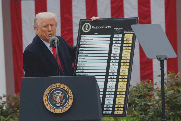 Image credit: REUTERS/Carlos Barria
In early 2025, during his second term as President, Donald Trump reintroduced a wave of aggressive trade tariffs aimed at foreign imports—particularly from China, Canada, and Mexico. These policy shifts triggered immediate discussions around economic impact, supply chains, and investor confidence.Through this series of data visualizations, we aim to uncover patterns, reactions, and economic vulnerabilities in the wake of Trump’s renewed protectionist agenda.
Evolution of Tariffs between US and China :
This dual-line chart shows the progression of average tariffs imposed by the US on Chinese goods and vice versa, over time. Key Insight: The chart provides a clear timeline of escalating trade tensions, and helps conc textualize market and economic reactions to rising trade barriers.
Share of Export to US by China :
This chart illustrates how dependent different Chinese industries are on exports to the United States. It highlights the share of Chinese exports to the US across various product categories. This helps assess which sectors in China may be most vulnerable to US tariffs. Key Insight: Sectors with high export reliance on the US may face stronger economic impacts under new tariffs.
Dow Jones vs Trump Tariff Announcements (2025):
This visualization overlays key tariff announcement dates on a time series of the Dow Jones Industrial Average. Key Insight: This allows a comparison of how different indices—often representing different segments of the economy—responded to tariff news.
NASDAQ vs Trump Tariff Announcements (2025):
This interactive line chart tracks the NASDAQ index from January to May 2025, with vertical lines marking key tariff announcements by Trump. Key Insight: The visualization enables viewers to visually correlate stock market fluctuations with each new tariff event, possibly revealing market sensitivity to protectionist policies.